How effective is the combination of your main product and ancillary texts?
Throughout my Ancillary texts i have always used continuity throughout, when looking at them i have used the same fonts all of the time. When researching about fonts i came across a font that i liked very much, it is rudimental font with the black border around the outside, i tried a vary of fonts but when i saw this one i wanted to make sure i had it, it stands out and resembles the artist himself, big bold and wants to be big. When creating my digipak i made sure that i kept the font the same throughout, although i made the titles bolder than the actual sub titles. this give the album a great effect. even when i was creating my poster i made sure i kept it the same to show continuity throughout. Also i made sure i stuck to the colour scheme because it would've looked daft me having different colours from my digipak to my poster so i made sure i kept the the grey, white and black colour code, when creating my music video i tried to stick to continuity by creating some scenes in black and white but when coming to it, it didn't work for me.


As you can see by the CD's they are still images from the music video this shows that i have generated the images from the music video and made them into a cd to create effect, this is good because likewise with the cover people will see the music video might not see who its by then look inside the cd and see the still images and remember it from the video this is good because its effective on the reader and what they see because they'll recognise my CD by the music video.
Overall, the combination of my ancillary texts and my Music Video combined are very effective, this is because i have used continuity and contrasted things from my music video to my ancillary, this is a good marketing scheme it makes the consumers recognise the artist by the way the Cd's set out, i have tried to replicate the video to the digipak, the way the digipak stands out is good because of the varied colours i have used, i have used the colour coordination what i had in mind for example black white and grey, i added a tint of pink to the digipak because i wanted to over emphasise the way the digipak looks and what it means, like its something good.
The way the poster reflects on both of them is good because it says where the consumers can buy the product. This is also a good marketing way because when they see the poster its effective as it will tell them where to go for it. the way it says in big bold lettering swell, OUT NOW this will tell the audience that they can buy it from when they see the poster as there is no date on it. The way the video reflects on the artist is good and effective this is because the audience will see him as having the utopia life.
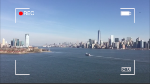
When looking at continuity i had to make sure i had establishing shots throughout my music video, these are three examples of the establishing shots within my music video, these bring effect to my video as they are conventional locations, they make my video have realism throughout, they make my video stand out. also i have created them to have effects of them for example as you can see the middle one is really happy and nice and the right one is really dull making the audience think you have your ups and downs but you're going to come back from it, these make up a set of camera shots the left one has a time lapse the middle one has a pan on it and the right ones a still video shot. these all create effect as they're the shots that make the video as conventional as it is.
These are some of the flashing images within my music video, these show that the beat will fit right into the flashing images to make it look like its going with the song, this is good because it shows the audience that they have to read so it engages them t watch it. its rather the lyrics or the name of the song or the name of the artist, other than that its all lyrics, this effect features 4 times in my music video for effect. lyric videos are usually seen to have been brought out before the original video to put in as a placement, with mine i have mixed both together to create that effect on the audience.
My artist features minimal within my media product this is because when looking at other media products the artist doesn't feature as much as they would in something like a hip hop genre song, this is because EDM's (electronic dance music) is all about the atmosphere and how it gets the people going, however within mine I've made sure the costumes the same as it needs to look real and look like other real media texts.
With my digipak i had to make sure I made the artist stand out, i had to make it so everyone knows who he he is and what he's about, thats why i created this cube, the cube is now a symbol throughout my digipak and features throughout my cd and my poster this creates good effect because its not just the artist on the cd its him in his symbol its what everybody sees him as this is effective because people will now see the cube symbol and suddenly recognise that its MANCELING.
As you can see by the CD's they are still images from the music video this shows that i have generated the images from the music video and made them into a cd to create effect, this is good because likewise with the cover people will see the music video might not see who its by then look inside the cd and see the still images and remember it from the video this is good because its effective on the reader and what they see because they'll recognise my CD by the music video.
Overall, the combination of my ancillary texts and my Music Video combined are very effective, this is because i have used continuity and contrasted things from my music video to my ancillary, this is a good marketing scheme it makes the consumers recognise the artist by the way the Cd's set out, i have tried to replicate the video to the digipak, the way the digipak stands out is good because of the varied colours i have used, i have used the colour coordination what i had in mind for example black white and grey, i added a tint of pink to the digipak because i wanted to over emphasise the way the digipak looks and what it means, like its something good.
The way the poster reflects on both of them is good because it says where the consumers can buy the product. This is also a good marketing way because when they see the poster its effective as it will tell them where to go for it. the way it says in big bold lettering swell, OUT NOW this will tell the audience that they can buy it from when they see the poster as there is no date on it. The way the video reflects on the artist is good and effective this is because the audience will see him as having the utopia life.
No comments:
Post a Comment